Brand & Identity Case Study
Souhoul
A premium meat brand rooted in Saudi heritage. Where the vast plains meet modern craft.
Brand & Identity Case Study
A premium meat brand rooted in Saudi heritage. Where the vast plains meet modern craft.
Souhoul is a Saudi premium meat brand built on hand-selected cuts, halal integrity, and deep-rooted heritage.
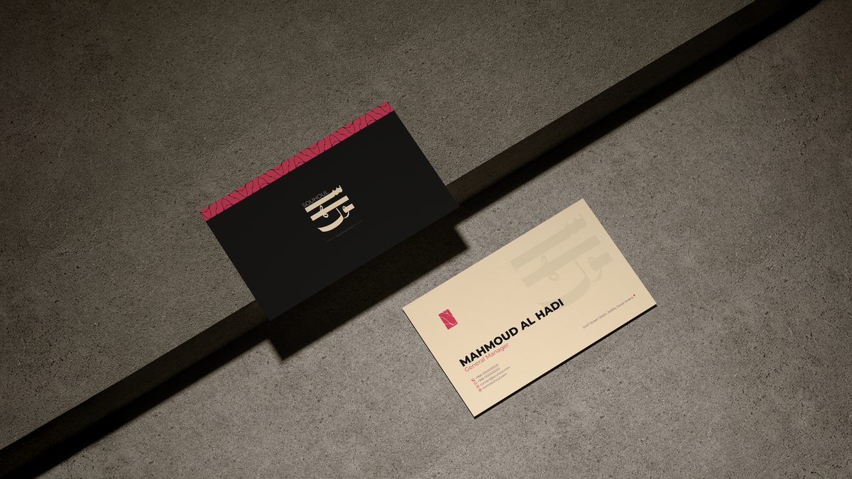
End-to-end brand identity: naming rationale, logo system, color palette, Arabic and Latin typography, heritage pattern, packaging, stationery, and social content direction.
Break through a commoditized market where price is the only differentiator and build a brand that earns trust and commands a premium without losing cultural authenticity.
"From the Plains" — the Arabic word سهول (souhoul) as a brand philosophy. Vast, open, pure. Where the finest livestock roam and tradition carries weight.
A living identity system deployed across 20+ touchpoints turning a local butcher into a brand people trust, remember, and return to.
Saudi Arabia's meat market runs on familiarity and price. Shops blur together no story, no soul, no reason to choose beyond habit. Souhoul's founders saw the gap: a customer willing to pay more, if only someone gave them a reason.
The brief demanded more than a logo. It called for a full brand position, one that could hold halal authenticity and premium sensibility in the same breath. Rooted enough to be trusted by tradition-first buyers. Refined enough to sit alongside high-end food concepts.
The answer lived in the name itself. سهول the plains, vast, honest land where livestock graze and nature sets the standard. We built an entire identity system from that single word outward.
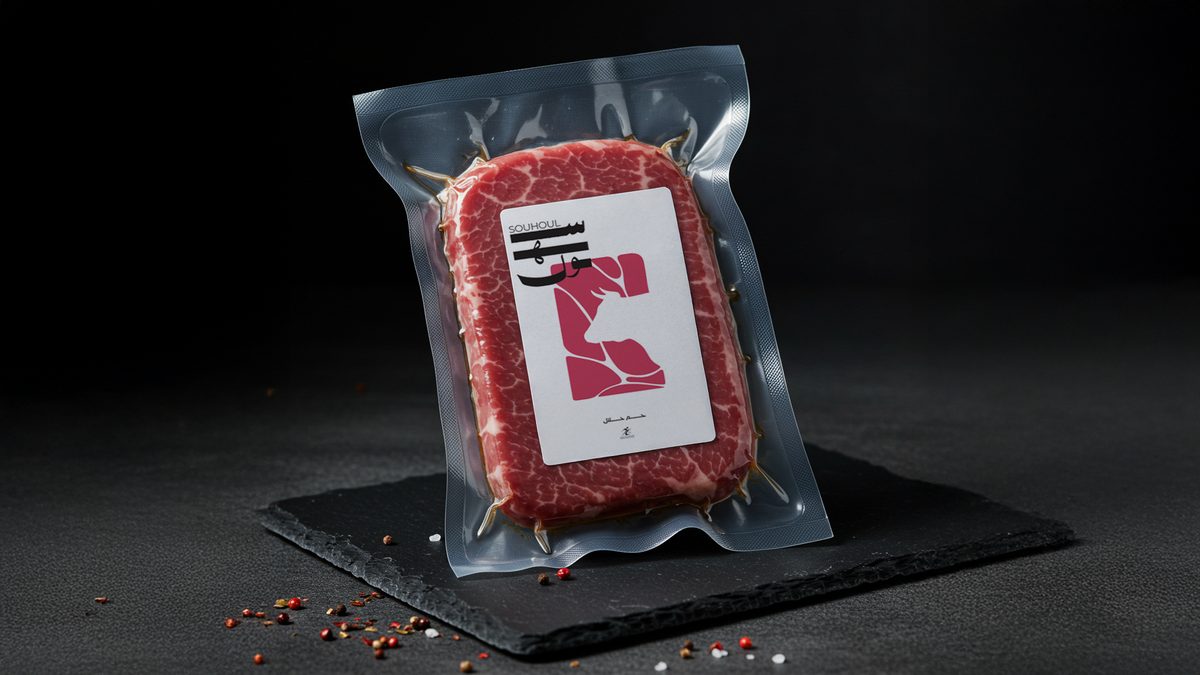
The name Souhoul draws from the Arabic word for plains: vast, open landscapes where the finest livestock is raised. Every design decision evokes the vastness of the land, the richness of the meat, and the precision of the craft.
Every cut hand-selected at peak quality. The brand communicates this not through claims but through the precision of its visual language.
Halal integrity is not a feature, it is the foundation. The identity reflects this with clean geometry, honest materials, and zero excess.
The Arabic letterform is not decoration. It is the core of the mark, carrying centuries of Saudi tradition into a modern retail context.
Premium without pretension. The palette, the texture, the spacing, each decision earns its place and signals quality without shouting it.
The extended Arabic script spells سهول, its horizontal sweep evoking vast open plains. The terminal stroke of the ل mirrors a precise butcher’s cut.
The bold red shape references marbled meat. It signals freshness and vitality while anchoring the mark in the brand’s core product.
Clean Latin type sits beside the Arabic wordmark without competing. The pairing signals global ambition without abandoning local identity.
"Every application from a kraft box to a social post, draws from the same visual grammar. The Heritage Cut pattern, the coral red, the deliberate white space. Souhoul is recognizable in a thumbnail. That is what a real identity system does."
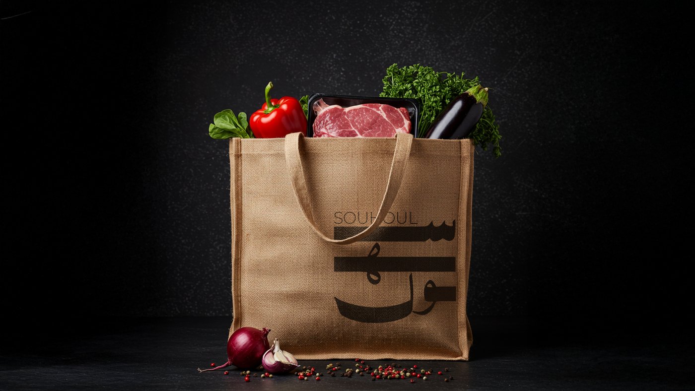
The identity system translated across packaging, stationery, merchandise, and retail environments each touchpoint reinforcing the premium positioning.
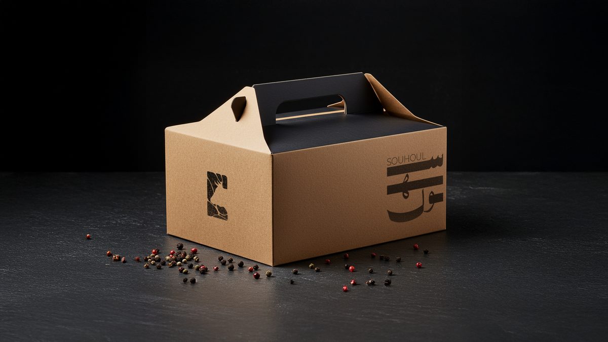
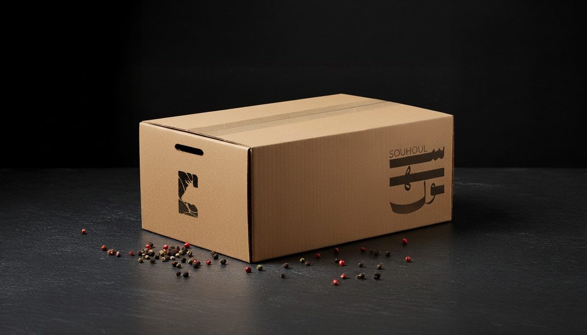
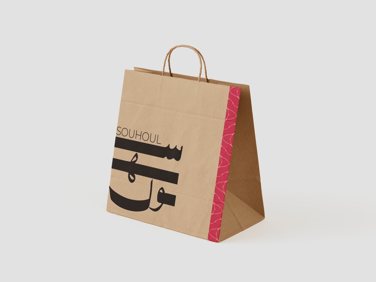
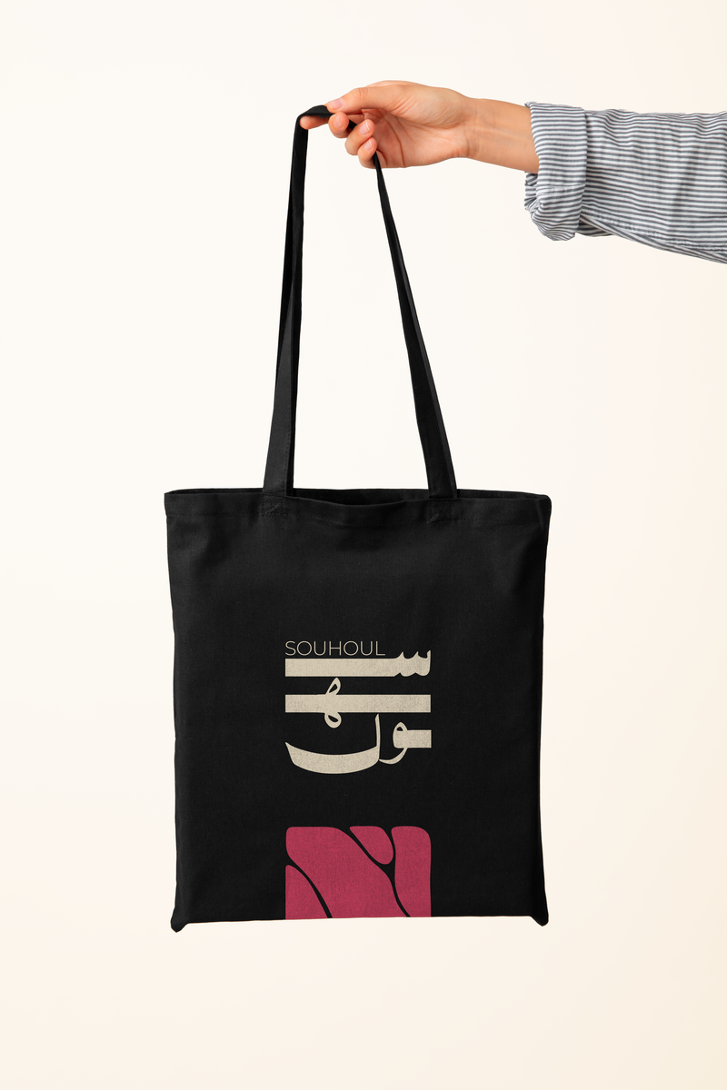
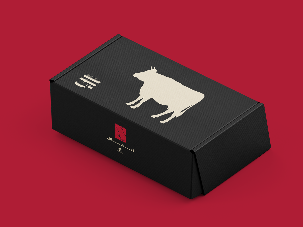
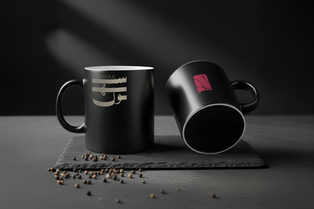
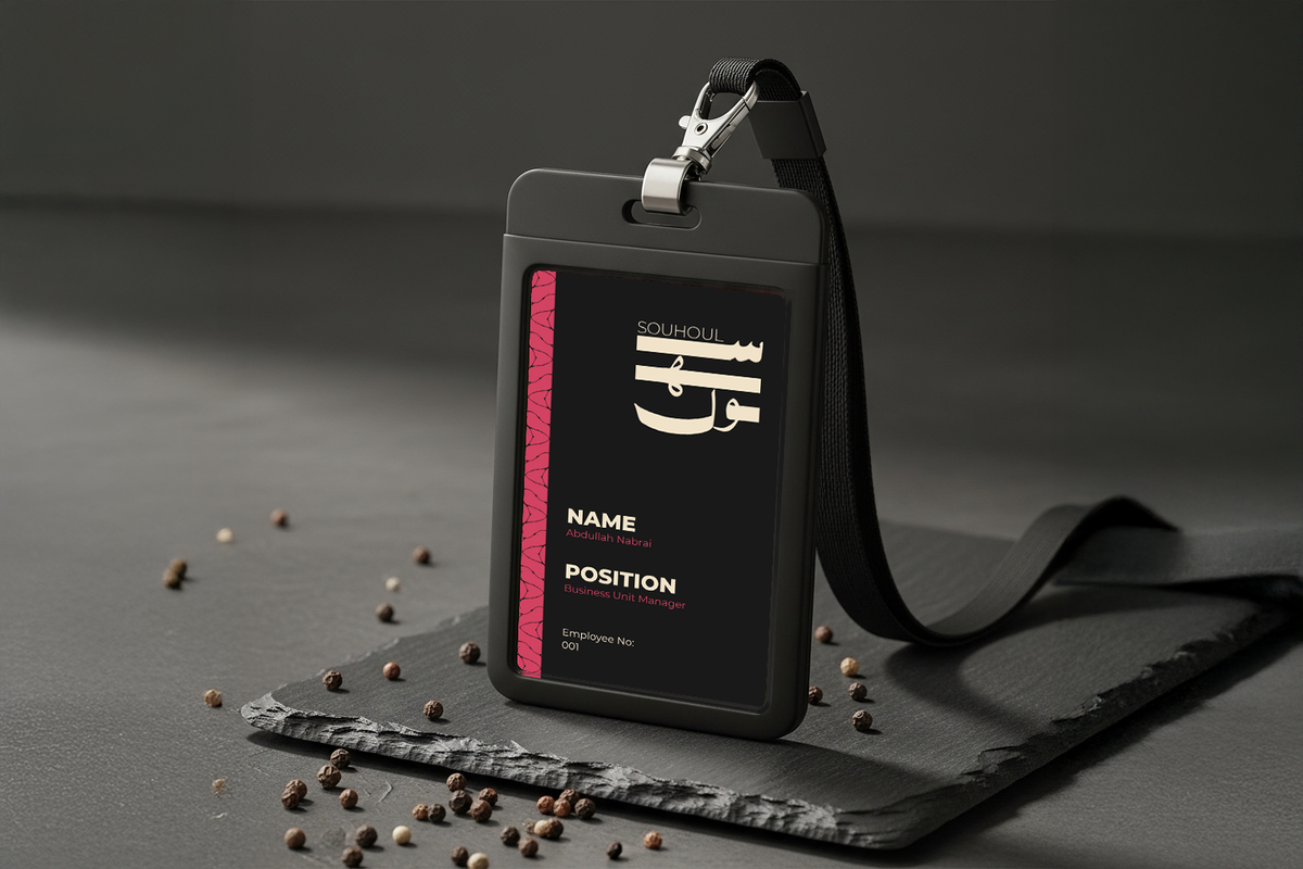
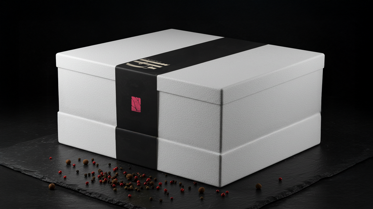
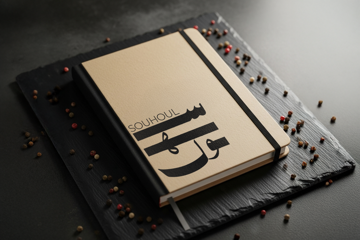
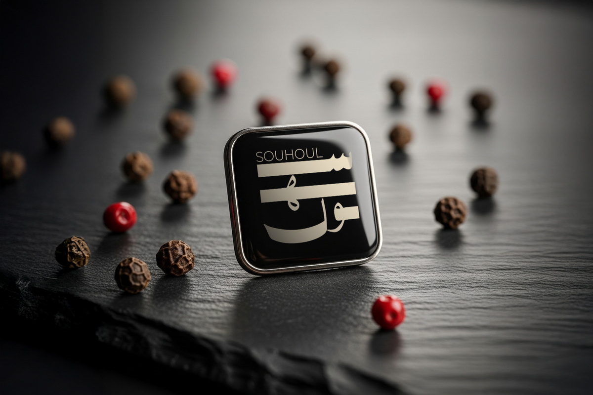
Souhoul is no longer just a meat shop. It is a brand with conviction, one that carries the same visual language from a kraft box to a social reel to a staff ID card. The identity system is live across packaging, stationery, merchandise, and digital platforms throughout Saudi Arabia. Every touchpoint consistent. Every detail considered. Every interaction a quiet signal that this brand knows exactly who it is.
Digital Storytelling
A curated visual language for digital platforms, where every post carries the weight of the brand.