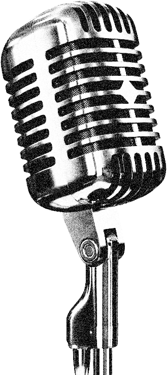
Full multimedia production for Omour Tabieya, a weekly radio podcast that dared to discuss intimacy, relationships, and the body in a culture that preferred silence.
Read the story ↓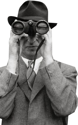
In Tunisia, topics like sexuality, body image, relationships, and emotional intimacy are rarely discussed openly, and almost never in mainstream media. The cultural weight around these subjects runs deep: they are hushed in families, absent from schools, and avoided by public figures.
Omour Tabieya ("Natural Matters") challenged that silence. A weekly radio podcast that decided to tackle these subjects with honesty and compassion, aimed directly at Tunisian youth who had grown up without language, imagery, or safe spaces for these conversations.
The brief to Azri Studio went far beyond aesthetics. It was a cultural navigation problem: build a brand strong enough to carry heavy topics, indirect enough not to provoke institutional resistance, and bold enough that young people would actually stop and listen.
Mainstream enough to reach a broad audience, transgressive enough to actually say something new.
A brand that felt too explicit would be dismissed. Too safe, and it would say nothing at all.
"The visual language had to be daring enough to spark curiosity, and abstract enough not to trigger the reflex to shut the conversation down."
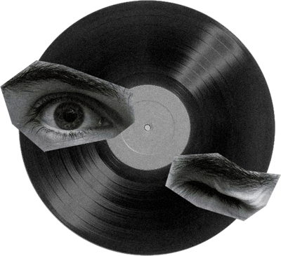
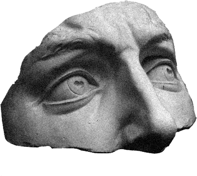
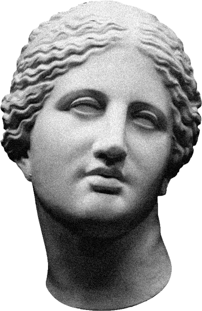
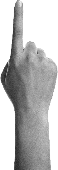
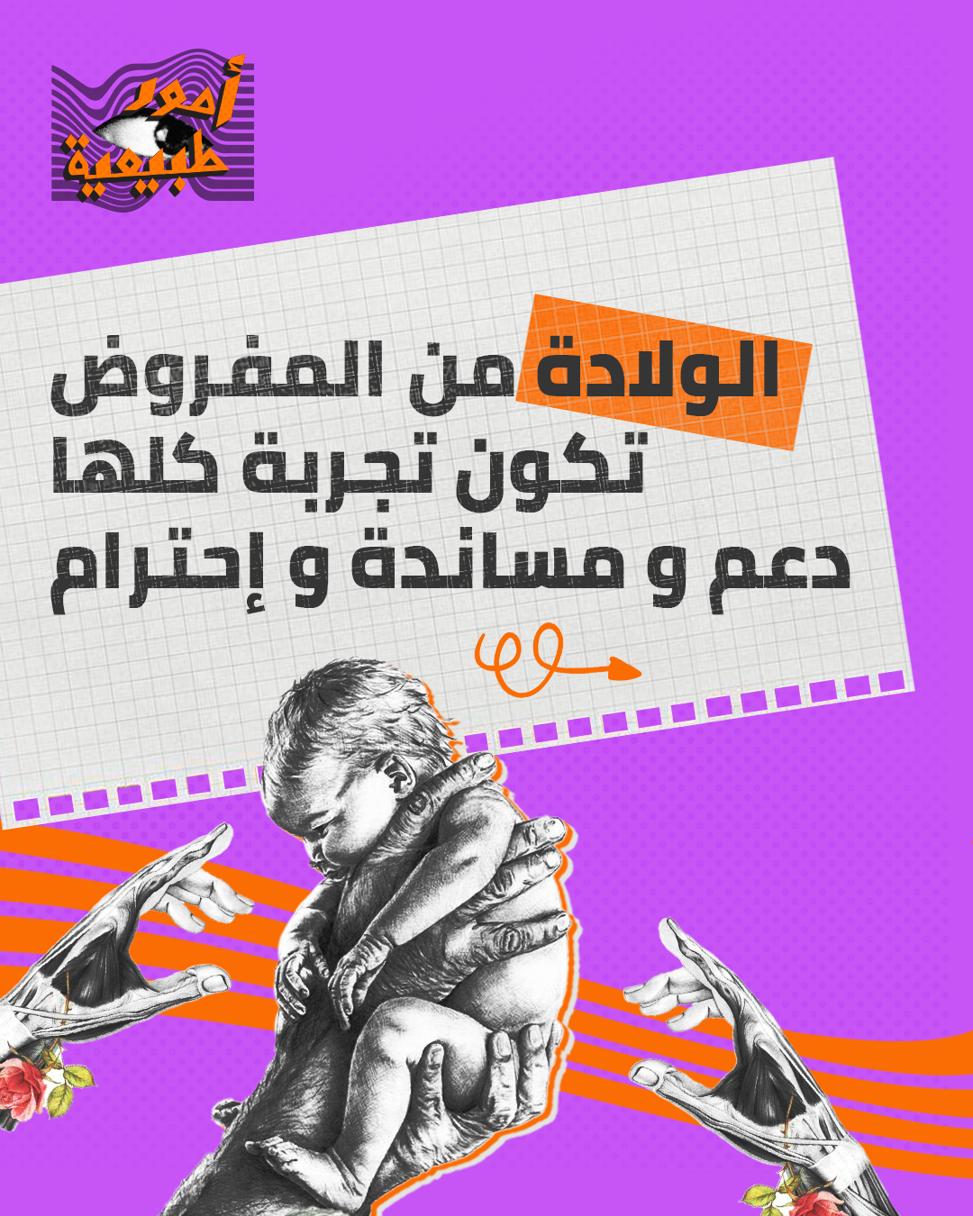
The answer wasn't a style. It was a strategy. By combining classical artworks, grayscale cut-out figures, and surreal visual metaphors, we built a vocabulary that could address intimate and sensitive topics without triggering the cultural reflex to look away.
Greek sculptures, vintage imagery, and surreal compositions let us speak about the body and relationships indirectly. Sophisticated enough for the message to land, abstract enough to disarm resistance.
Layering antiquity and modernity, beauty and tension, the brand created a visual system that normalized conversations around intimacy without ever stating them outright. The message lived in the composition.
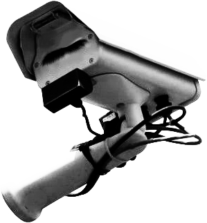
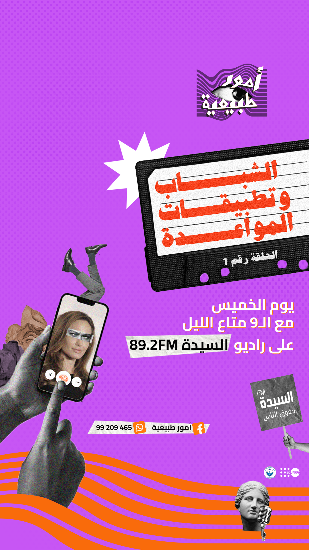
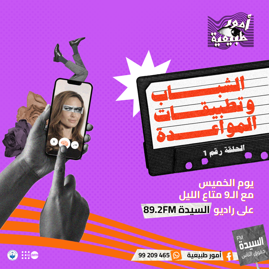
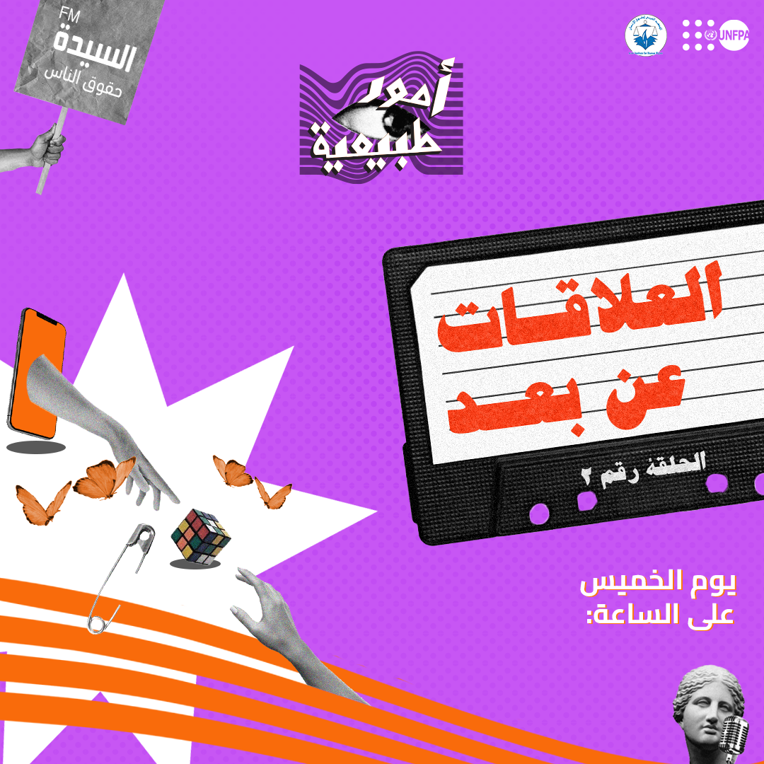
Bold electric purple, cassette tape motifs, and vivid typography gave the show an exciting, youthful identity, lowering the psychological barrier to engagement by making the conversation feel thrilling, not clinical.
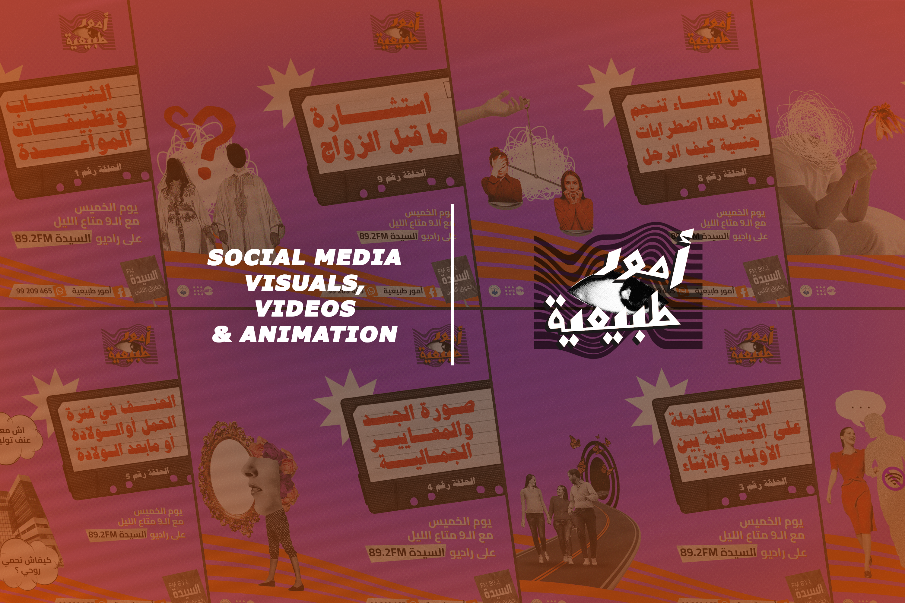
Each topic received its own complete visual identity: poster, animated teaser, and educational campaign. The system was flexible enough to hold every story while keeping the brand cohesive.
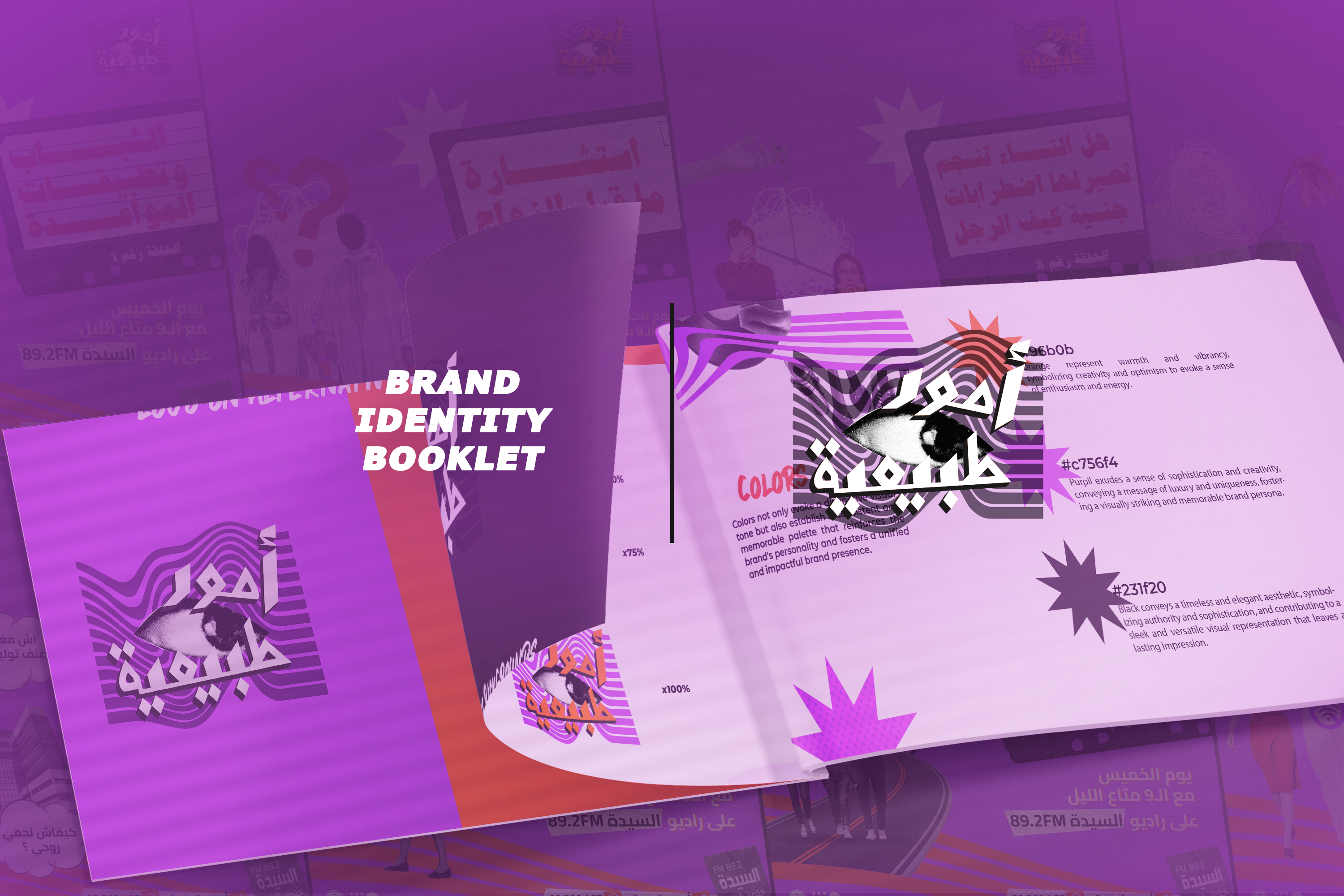
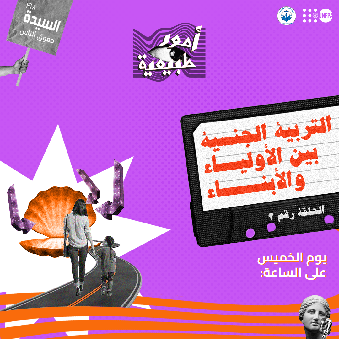
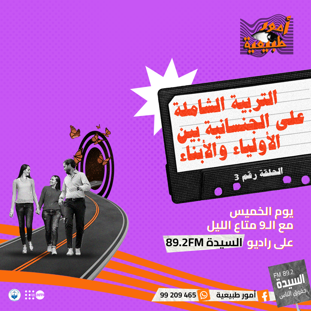
The complete brand system defined every visual rule for the show. From the hypnotic eye logo that serves as its core symbol, to the wavy-line system, the electric purple-and-orange palette, and the cassette-tape vernacular that ran through every touchpoint.
Every element was a deliberate choice: the eye in the logo represents the act of seeing something for the first time. The wavy lines represent the distortion of what we assume to be "normal." The collage represents the act of assembling something new from fragments of what already exists.
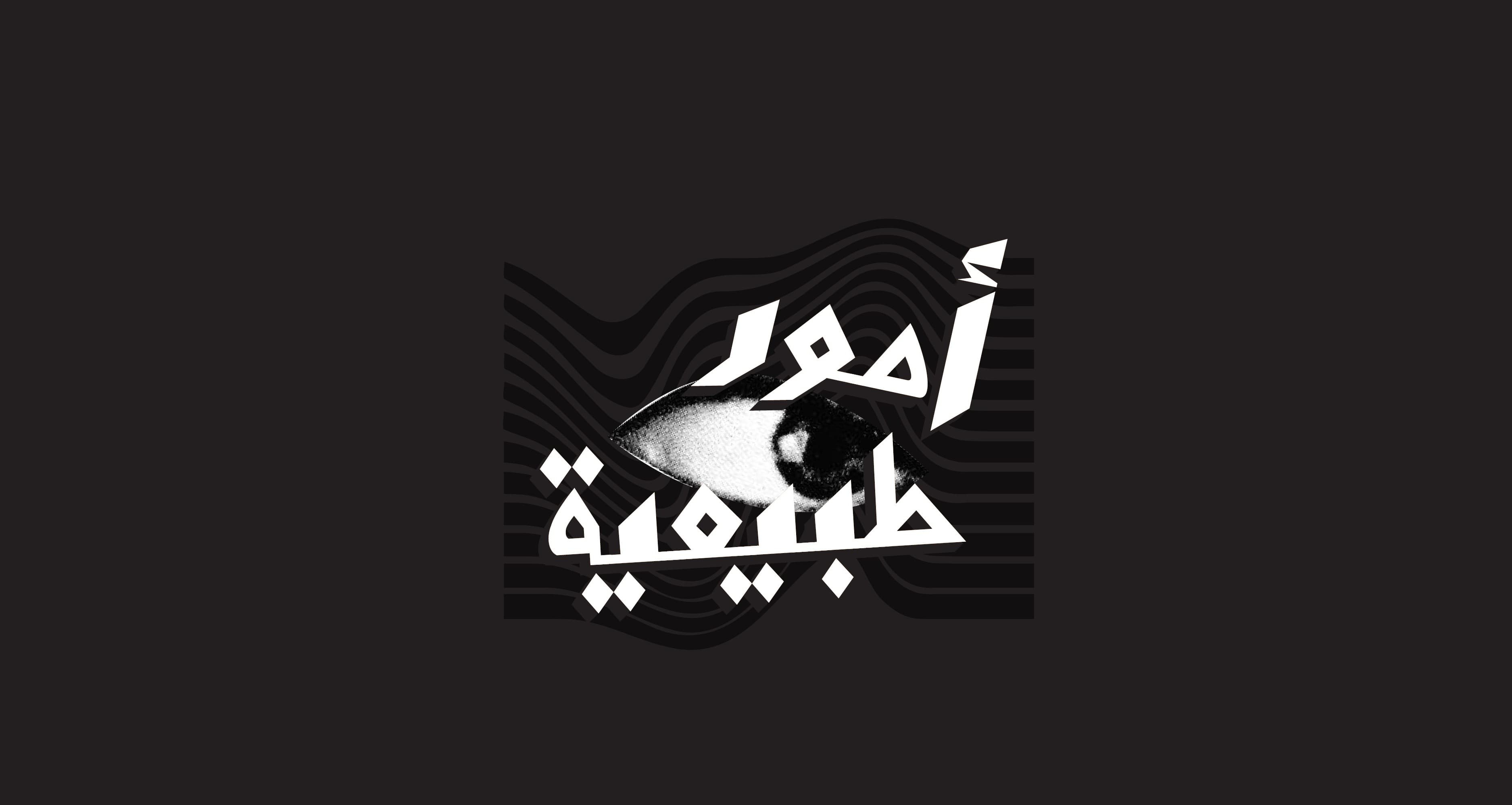 The eye. The wave. The word.
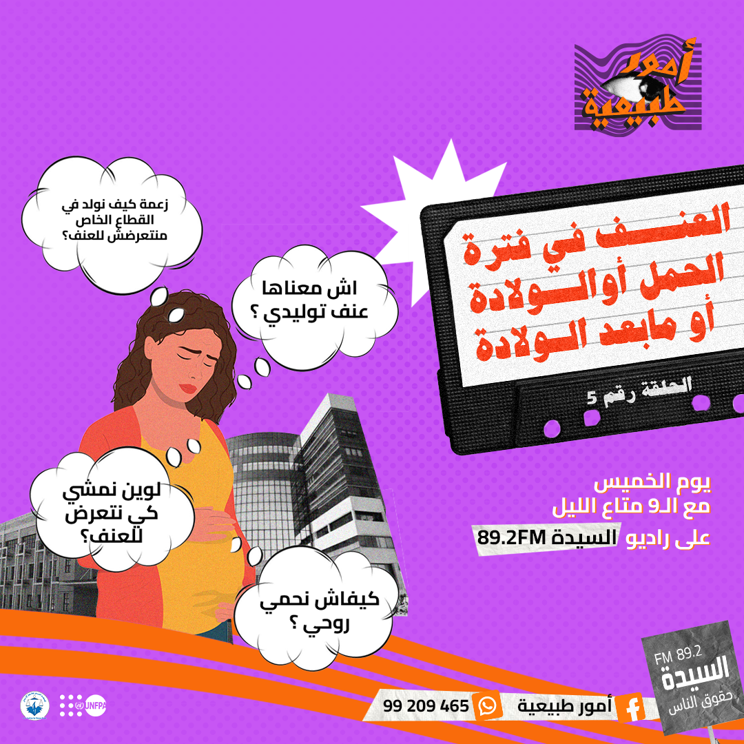
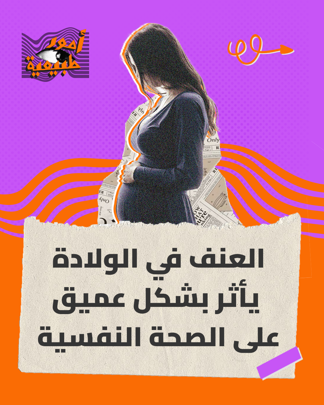
Each episode tackled a distinct topic: dating in the digital age, body image and social standards, pre-marriage realities, long-distance relationships, and intergenerational intimacy conversations. Every one received its own full visual treatment through poster, teaser, and social campaign.
.png)
.png)
.png)
.png)
Each episode launched with a visual teaser, a short-form animated piece that introduced the topic using the show's collage language. Designed to stop the scroll and open the conversation before it had even begun.
Alongside the radio broadcasts, the studio produced a series of animated video lessons: short educational pieces that went deeper into each episode's subject, designed for social media distribution and maximum accessibility.
Animated Educational Video
Animated Educational Video
Animated Educational Video
Animated Educational Video
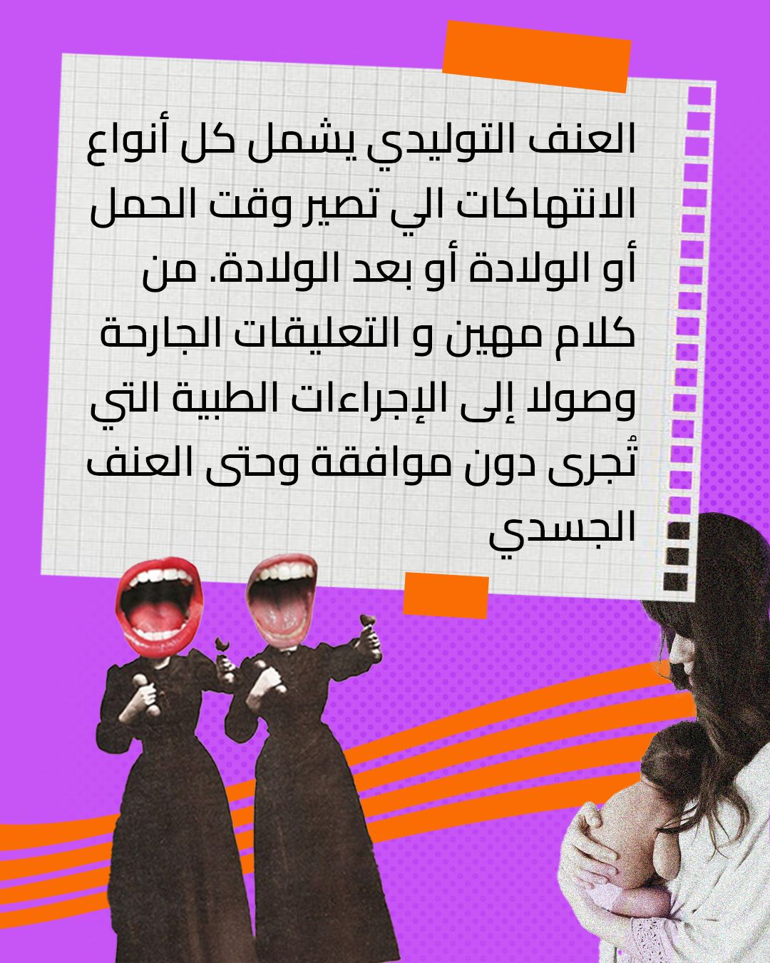
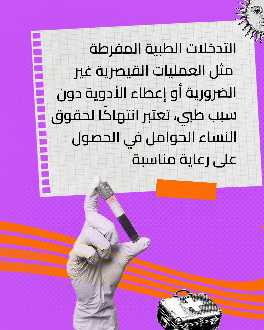
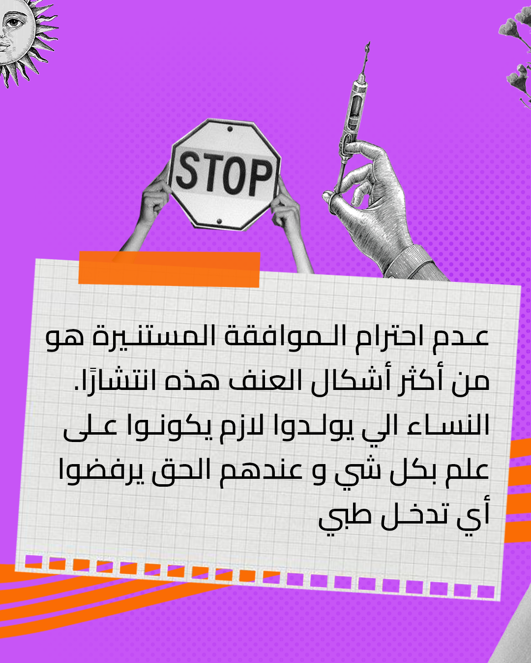
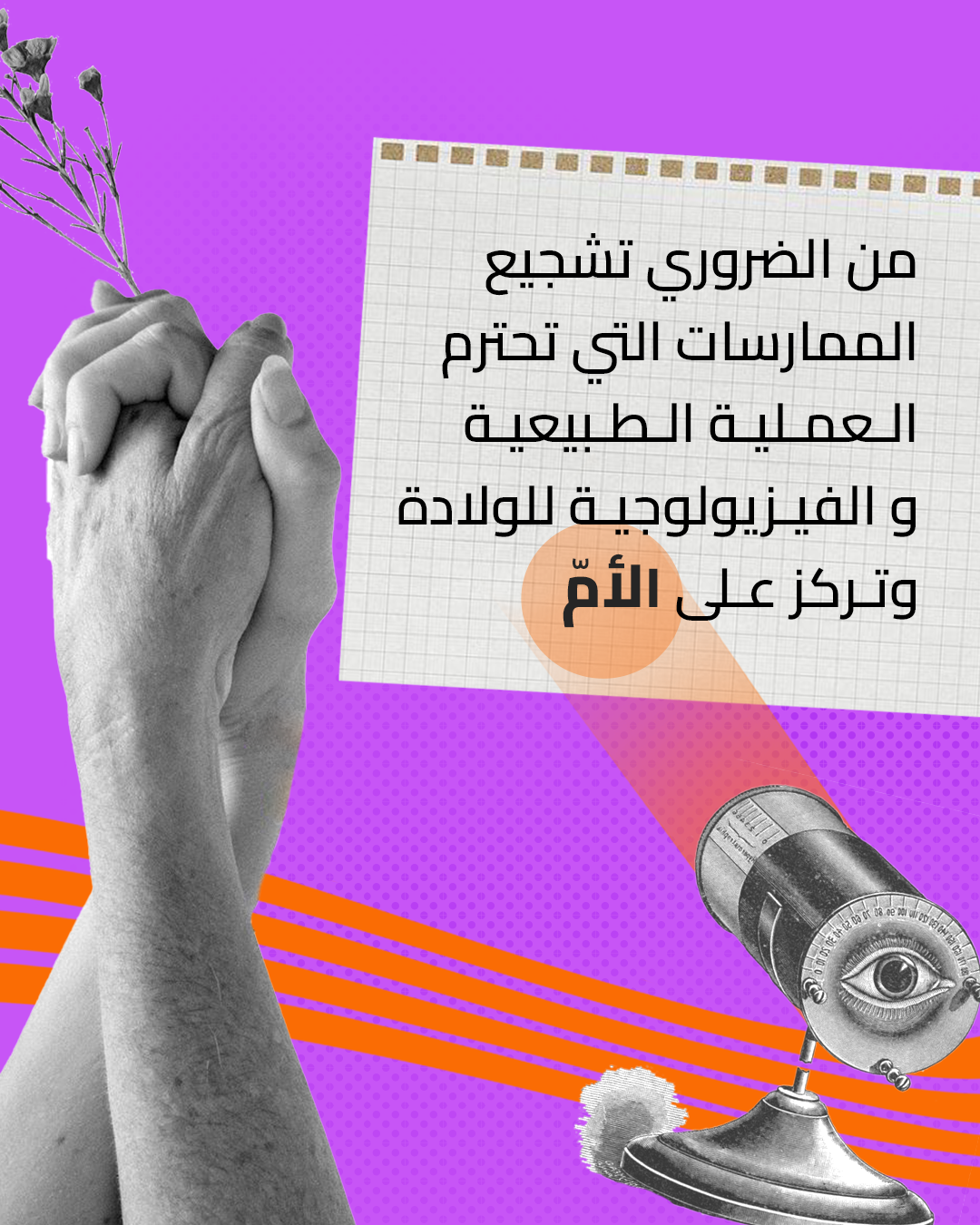
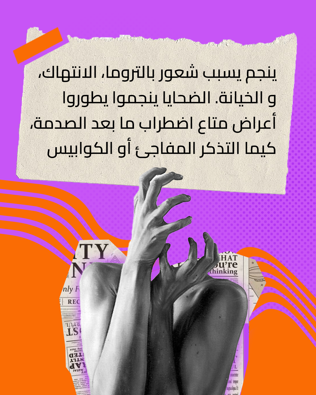
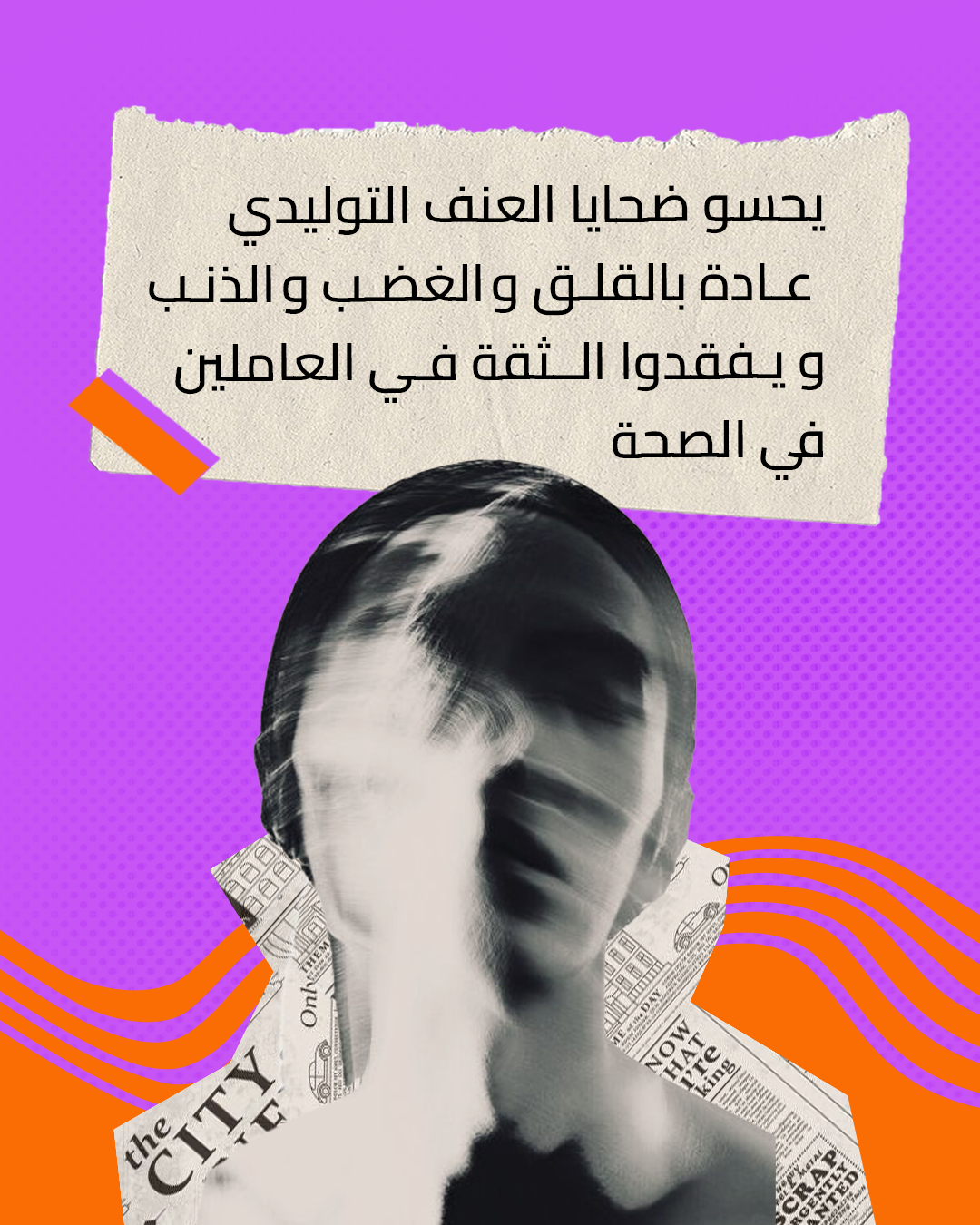
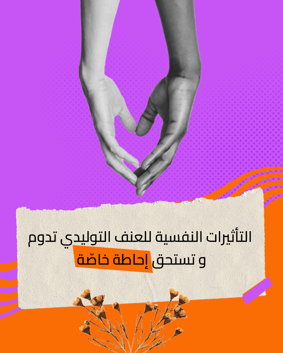
Multi-slide carousel campaigns created for Instagram, each one breaking down a topic across a swipeable visual sequence, using the collage language to make dense subject matter accessible and shareable.
Omour Tabieya proved that in the right hands, design can do what words alone cannot. It can open doors that were never meant to open, making a conversation that society had buried feel not just possible, but necessary.
The show sparked a dialogue that hadn't existed in Tunisian media. Azri Studio built the visual language that made it safe enough to have.